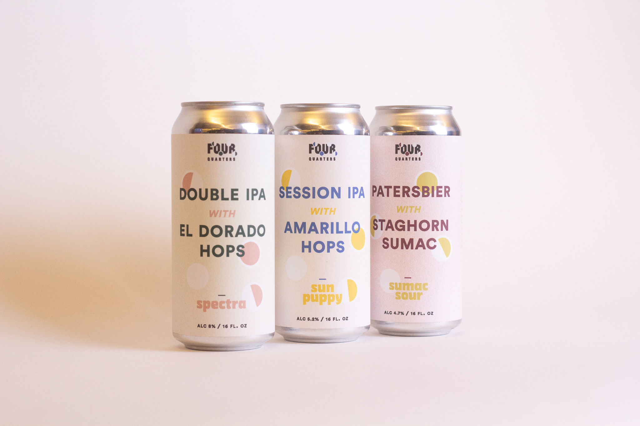
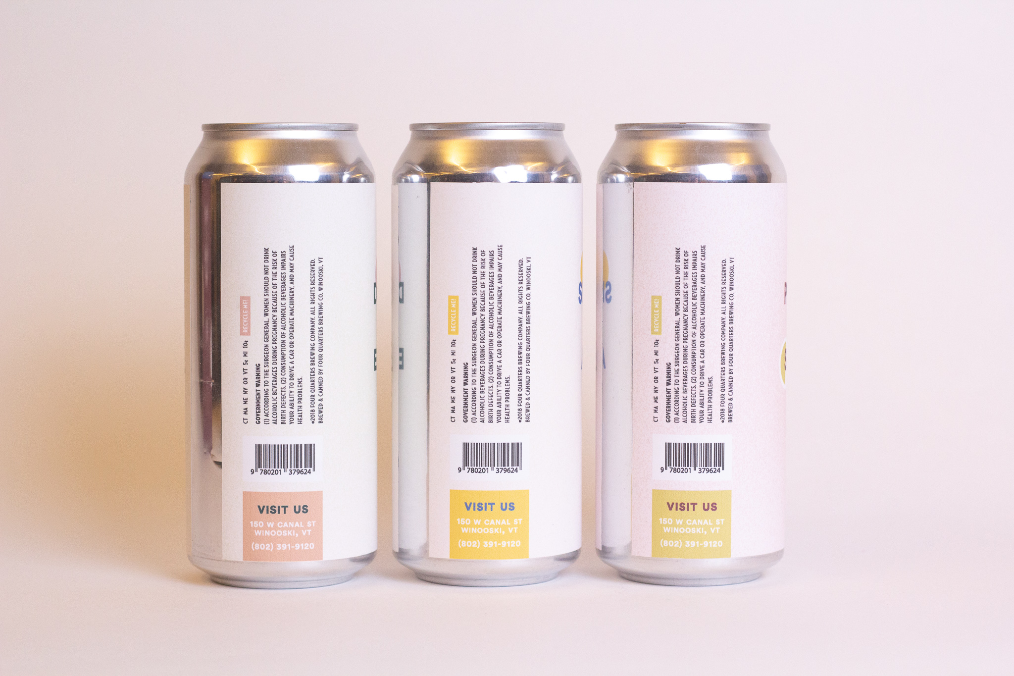
A rebrand of an existing craft brewery in Vermont, Four Quarters. The goal here was to maintain the brands appreciation for natural ingredients and its connection to the moon cycles while improving its visual consistency and shelf-presence. It aims to appear natural and fun while also sophisticated and established. The logomark represents the four main phases of the moon cycle (something the company embodies strongly) along with the brand name, and each brew color represents the natural ingredients it was made of.